

Flexible table resizing.
The design.
Before, tables only had 3 standard widths and no way to evenly distribute columns. An upward trend in feedback tickets concerning the lack of flexible table resizing, coupled with a surge in community posts and ticket upvotes, elevated the issue. I was placed on the secondment team to provide a detailed exploration of possible solutions and align the team on a final direction. I handed over the work to another designer once the secondment was over and was not a part of the final make phase.


I maintained consistency with Media resizing handles. Utilising the left hand size to avoid controls on the right.
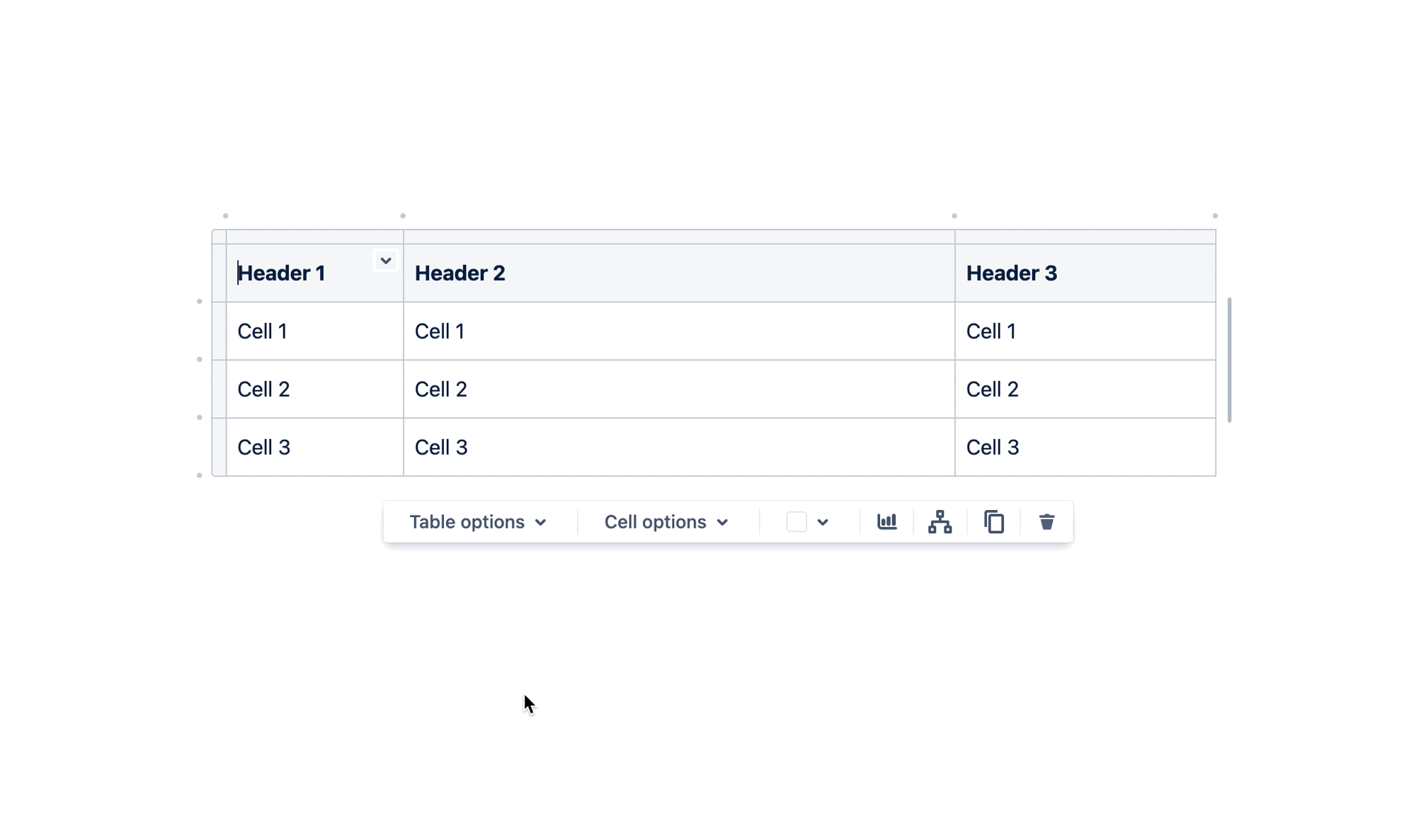
I designed a way for users to quickly distribute columns without adding more complexity to the UI
To tackle this challenge, I collected and synthesized community posts and tickets that shed light on resizing issues. The project itself presented a unique challenge, demanding a design that was compact enough to fit within the confines of the editor while maintaining consistency with competitors to enhance learnability. I sorted these insights into a cohesive framework and communicated them to stakeholders, facilitating team alignment towards a definitive resizing solution. My collaboration with developers was instrumental in exploring the feasibility of these resizing improvements and addressing potential performance concerns.

The process.
-
I synthesized user research data from both our feedback portal and community hub, distilling the pain points that users were encountering. Simultaneously, I expedited the resolution of identified 'bugs' by collaborating with developers.
To gain deeper insights into the challenges users were facing, I ran a competitor analysis. Furthermore, I conducted five usability tests on the restricted resizing functionality of tables, allowing me to observe and understand firsthand the pain points users were grappling with.
-
I initiated the ideation process, drawing inspiration from both our competitors and the primary data I had gathered. I generated a pool of 40 potential solutions, narrowing it down to three viable options after considering engineering feasibility. Through an iterative approach, I conducted six usability tests, refining the design multiple times before ultimately delivering a refined spec.
The spec included detailed guidance on the handle design, the grid approach, the impact of resizing on context (fixed vs. responsive), and how browser width influenced these factors. Additionally, I provided a glimpse into the 'ideal future', offering the team a long-term vision for the evolution of table design.
-
I was not apart of the make phase as the secondment had finished

The impact.
We successfully addressed the most highly-voted pain point within the Confluence editor, which had garnered thousands of upvotes. Now users can flexibly resize tables to what ever width they need.